
Objective
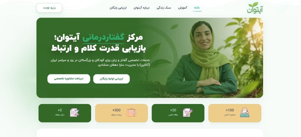
Present a practical platform clearly: what it is, how it is organized, and where to go next — without ornamental clutter.
UX structure
Information architecture first. Labels and grouping should make the next click obvious.
Visual direction
A professional, quiet interface. Structure does the work; color and type stay supporting.
Responsive experience
The layout compresses into a readable stack; primary actions stay reachable.
My role
Website design, UI/UX and development — so the information architecture was not separated from how the site actually behaves.